Understanding the Power of Color in Bead Crafting
Color is one of the most expressive tools a bead crafter can use. It shapes the mood of a piece, highlights its structure, and transforms simple materials into something visually meaningful. Choosing the right color combinations can make even the simplest design look thoughtful and striking. For beginners, working with color might feel overwhelming because the choices seem endless, but understanding how colors interact makes the process much easier. Every color has its own character, and when paired thoughtfully, they create harmony, contrast, or balance that elevates your jewelry. Learning to work with color is a skill developed through practice, observation, and curiosity, and once you begin to explore these principles, your designs will naturally become more expressive and visually appealing.
Exploring the Basics of Color Theory
Color theory offers a simple framework for understanding how different shades complement, contrast, or enhance each other. The color wheel is a helpful visual tool that organizes colors in a circle, showing their relationships at a glance. Complementary colors sit opposite each other on the wheel, such as blue and orange or purple and yellow. These combinations create bold contrast and high visual energy. Analogous colors, like blue, blue-green, and green, sit next to one another and create a calm, harmonious look. Triadic schemes use three equally spaced colors, offering a bright and balanced effect without overwhelming the eye. Once you understand these categories, you can start experimenting with confidence, knowing that certain colors naturally work well together.
Choosing a Color Palette Based on Mood and Style
Every jewelry piece carries a mood, and color is one of the easiest ways to shape that mood. Soft pastel colors create a gentle, romantic feeling, while bright primary colors give a sense of fun and playfulness. Earthy tones such as brown, olive, and terracotta feel warm and grounded, while monochromatic palettes in shades of black, gray, or white feel modern and minimalist. When choosing a color palette, think about the feeling you want your project to convey. Is it light and cheerful? Calm and elegant? Bold yet classic? By matching your colors to the mood, you create pieces that feel purposeful and visually consistent. It helps to gather beads in your chosen palette and examine them together before starting your project.
Working With Contrast for Visual Interest
Contrast is one of the most effective ways to make bead jewelry stand out. High-contrast combinations catch the eye immediately and give energy to the design. This can be achieved through complementary colors, dark-and-light pairings, or mixing muted tones with bright accents. For example, dark blue beads paired with shimmering gold create a dramatic yet elegant look. Black beads combined with a pop of red or emerald green add a striking, modern touch. Contrast does not have to be extreme; even slight differences in tone or brightness can bring depth to your piece. The key is balance—too much contrast can feel chaotic, but one strong contrasting color used sparingly can add just the right amount of interest.
Using Neutral Colors to Balance Bold Shades
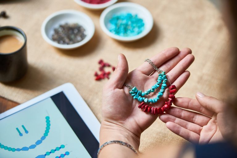
Neutral colors play a crucial role in helping bright or complex colors feel grounded. Shades such as white, beige, gray, brown, and black work as stabilizers within a color palette. When used alongside bold colors, neutrals help create breathing room in your design, allowing the brighter beads to shine without overwhelming the overall piece. For instance, a bracelet featuring vibrant turquoise beads becomes more wearable and elegant when combined with soft beige or cream tones. Similarly, a necklace made with metallic beads may feel more refined when paired with clear or muted accents. Neutrals can be especially helpful for beginners because they make color experimentation feel safer and more cohesive.
Drawing Inspiration From Nature
Nature offers endless color inspiration for bead crafters. Flowers, oceans, forests, and landscapes often combine colors in ways that feel perfectly balanced and naturally pleasing. Soft pinks and greens may remind you of spring blossoms, while deep blues and sandy tones evoke a peaceful beach scene. Sunset-inspired palettes of orange, gold, and purple create warm, glowing designs. Taking inspiration from nature is an excellent way to discover unique color combinations without needing advanced color theory knowledge. A simple walk outside or a quick look at a landscape photograph can spark fresh ideas for your next bead project.
Using Texture and Finish to Enhance Color
Color is only one part of a bead’s appearance; texture and finish also play important roles in how colors behave within a design. Glossy beads reflect light and make colors appear brighter and more vibrant, while matte beads soften the palette and create a more subtle effect. Metallic beads can add warmth, luxury, or sparkle to a design, enhancing the surrounding colors. Transparent beads allow light to pass through, creating layers of depth that make even simple color combinations feel dynamic. Mixing finishes gives your projects a rich, multi-dimensional look. For example, combining matte pastels with a few metallic accents can make a design feel both soft and sophisticated.
Creating Cohesive Color Patterns
Once you select your colors, arranging them into a cohesive pattern is the next step. Patterns help guide the eye and create flow within your design. You can follow simple repetitive patterns that alternate between two or three colors, or you can experiment with gradual transitions that shift from one shade to another. Grouping colors in small clusters creates focal points, while evenly distributed colors produce a balanced, consistent feel. The key is to experiment and adjust as you go. Laying out beads before stringing them can help you visualize the final result, allowing you to refine the placement of each color until it feels just right.
Trusting Your Instincts and Personal Style
While color guidelines can be helpful, personal creativity is the heart of bead crafting. Your preferences, instincts, and individual style are what make your jewelry unique. Some crafters are drawn to soft pastels, while others love bold, bright combinations. Some prefer earthy, natural palettes, while others enjoy a more modern, monochromatic look. Over time, you will develop a deeper understanding of the colors you enjoy working with and how to combine them in ways that feel intuitive. The more you experiment, the more confident you will become in trusting your own sense of color. Jewelry that reflects your style will always feel authentic and satisfying to create.
Experimenting With Confidence
Choosing bead colors becomes easier with practice, and the process should always feel playful and enjoyable. Begin with simple combinations and gradually explore more adventurous palettes as you gain experience. Don’t hesitate to rearrange, adjust, or completely change your colors mid-project if something doesn’t feel right. Creativity is a flexible process, and every experiment teaches you something new about color relationships. The more you allow yourself to explore freely, the stronger your color intuition becomes. Over time, you will develop an eye for combinations that feel balanced, expressive, and beautifully suited to any bead project you create.


